Indiana, Robert
First published in The Guardian, 2 October 2014.
Robert Indiana had been experimenting with different versions of his LO over VE “LOVE” design in paintings since 1958, but it was when the Museum of Modern Art in New York commissioned him to design a christmas card in 1965 that it began its global domination. It became one of the museum’s most popular items and the next year he capitalised on this success with a LOVE themed exhibition of paintings, drawings and small sculptures. Chiming perfectly with the ideals of the hippy generation, LOVE quickly became ubiquitous. (Sniffing the wind, my senses tell me we are in the territory of a joke. Immediately I stop, rigid, every hair standing on end, my ears erect……..nothing. The danger has passed. Read on). Indiana tried to copyright his endlessly ripped off design but was refused on the grounds that you couldn’t copyright a single word. In 1970, he created the first of many public LOVE sculptures. It wasn’t long before cities all over the world had the sculptures in their parks—Boston, New York, Philadelphia, New Orleans, Vancouver, Lisbon, Jerusalem, Tokyo, Singapore, and more. And just to cement its ubiquity, the United States Postal Service reproduced Indiana’s design for an 8-cent Valentine’s Day stamp in 1973. It sold more than 300 million copies and became, for many years, the best-selling commemorative stamp in history.
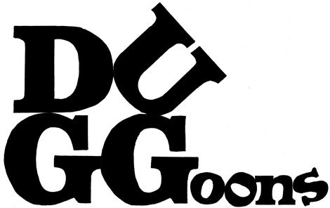
The letters of LOVE form a solid square, divided into four. I enjoyed mucking this stability up – the G makes it unbalanced and awkward, like it might topple over. The sense of unease this conveys gives an insight, I think, into the appeal of the original LOVE artwork. It is very “secure”, it is strong and stable, yet also, with the tilted O, slightly unpredictable and fun. I guess that’s what most people want in love. Perhaps this is part of the design’s unarguable appeal.
The tilted O was common in medieval typography, and Indiana has variously described the leaning letter as representing either a cat’s eye or an erect phallus. I think this is a classic case of interpreting the work after it is done, rather than a motivation for doing it. I don’t think he thought “I really need a cat’s eye in there. That’d be cool” However it is interesting how, once you tamper with such a loaded word, you want to assign meanings to the visual interventions. I know, because I had initially drawn a different version of this cartoon – Indiana in his studio, scratching his head, surrounded with not-quite-successful attempts to get to his masterpiece. I had come up with a load of variations and had put a lot of thought into where they were placed so that you could read through the (hopefully humorous) changes in some sort of sequential order. One last thought made me abandon it: “Will anyone ever get this?”
OK, I know you would – it’s the others I worry about. I just can’t leave them behind. I love them.
First published in The Guardian on 11th Jan 2012


